The Ship Inn – Reedham
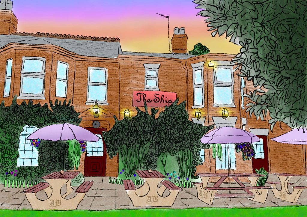
This A4 digital drawing was inspired by the warmth and character of British pub culture, and by a particular pub situated directly on The Broads. The quote, “There are no strangers in a pub, only friends you haven’t met yet,” captures the sense of familiarity, community and connection that I associate with these spaces.
I was drawn to the beauty of this particular setting – surrounded by bright light, nature and stunning views across the water. Through this piece, I wanted to capture not only the character of the pub itself, but also the atmosphere of a place where people come together, slow down and enjoy their surroundings.
Growth
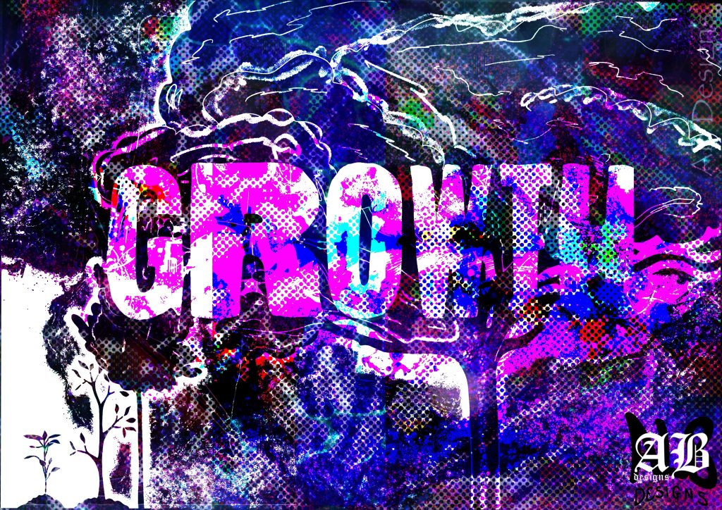
This is an A4 digital drawing I created at university in response to an open brief exploring the theme of ‘growth’. I was immediately drawn to nature as a subject and decided to take a literal approach the idea, exploring how something as seemingly simple as a tree can become increasingly layered and complex as it grows.
I chose to depict the different stages of a tree’s growth, building up the image through layers and experimenting with texture, colour and composition. Using Photoshop, I played with these elements to create a vibrant and highly textured final piece, reflecting the organic and ever changing nature of growth.
“I would never do it. But it’s always on my mind”
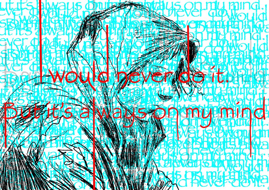
This A4 piece is part of a series exploring the relationship between words, emotion and visual expression. For each piece, I began with a quote and used it as a starting point to interpret and visually communicate how it made me feel.
This work combines expressive line work with layered typography, allowing the words to become part of the overall composition rather than simply communicating their literal meaning. I restricted the colour palette to just three colours, using this limitation to create contrast, depth and visual impact while keeping the focus on the emotion and energy of the piece.
My Favourite Safe Place
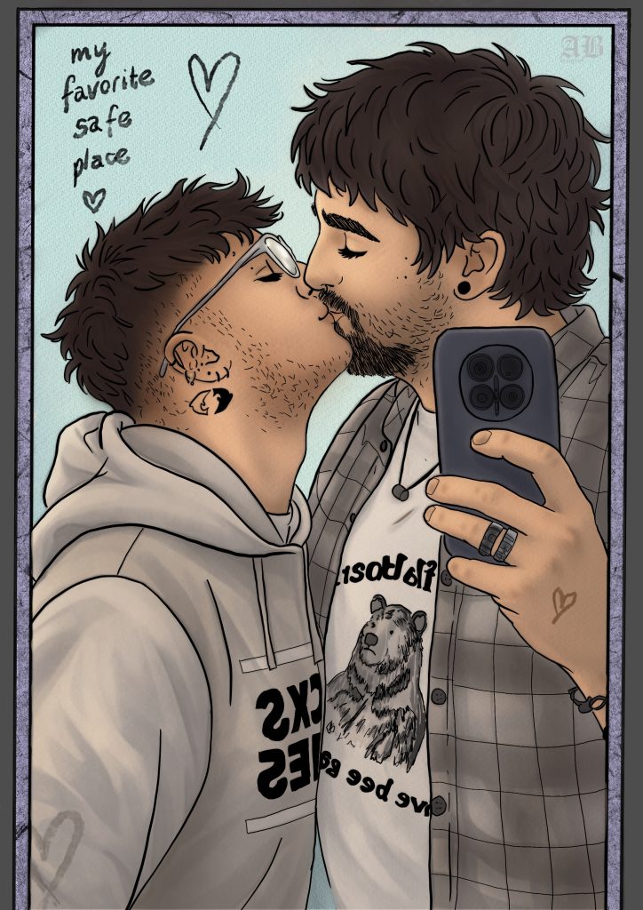
This A4 digital self-portrait depicts myself and my partner, exploring the space between realism and illustration. I wanted to capture our likeness while moving away from a purely realistic representation, creating a style that feels both recognisable and slightly playful.
I used a muted colour palette and layered tones to build depth and dimension within the piece. The balance between simplified, cartoon-like forms and more realistic details allowed me to create a portrait that feels personal while still reflecting my own approach to digital drawing.
Fan Art
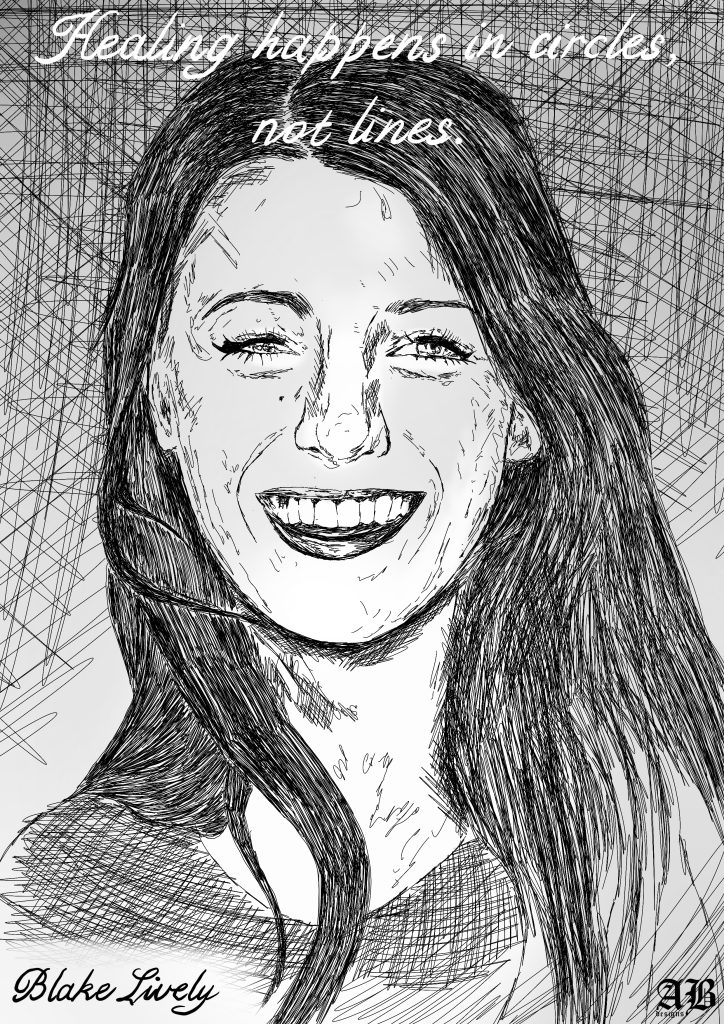
This A4 digital fan art piece of Blake Lively was created as an exploration of line work and simplicity. I set myself the limitation of using only one line weight throughout the entire drawing, challenging myself to create definition, depth and character without relying on variation in line thickness.
I kept the shading intentionally minimal, using it only in the background to create subtle depth while allowing the line work and portrait itself to remain the main focus. The restrictions of the process encouraged me to be more considered with every mark and to explore how much could be communicated through line alone.
Split Lady
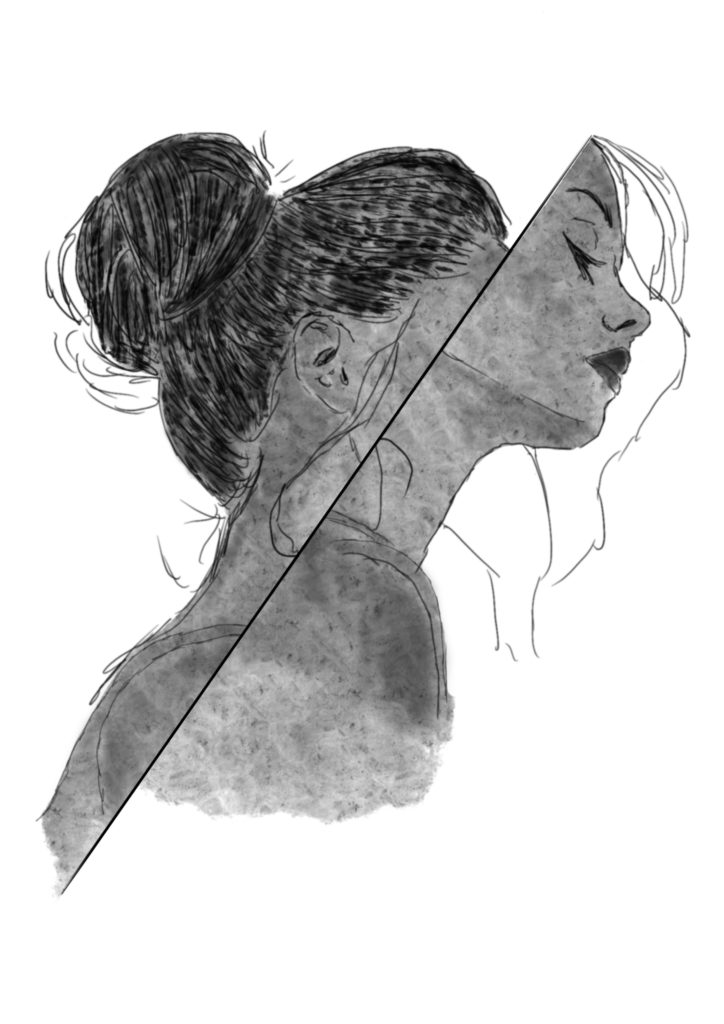
This piece was created at university as part of my final project, exploring themes of identity and the internal struggles that can come with mental health. The portrait is split in half to represent the contrast and complexity within a persons sense of self.
I kept the composition intentionally simple, focussing on tonal variation and texture to create depth and atmosphere. By reducing the image to these fundamental elements, I wanted the visual contrast within the portrait to speak for itself, reflecting the idea of an identity that can feel divided, layered or difficult to understand.
EDUCATE YOUR SONS!
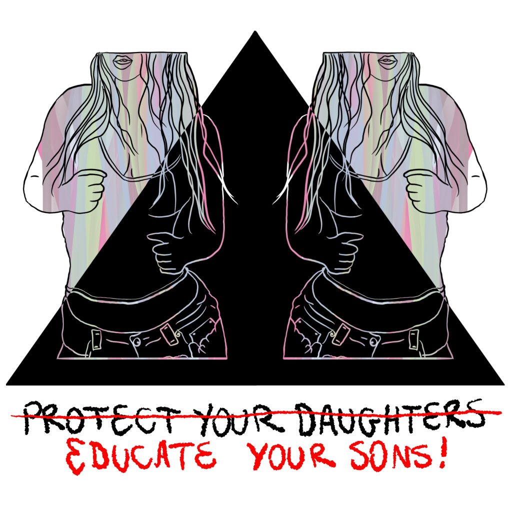
Created as part of a university project responding to the kidnapping and murder of Sarah Everard by a serving Metropolitan Police constable, this digital piece explores the sexualisation of women and the ways in which female bodies are viewed through the male gaze.
The work challenges the idea that women and girls should be taught to protect themselves from male violence, instead questioning where responsibility is placed within society.
Through its imagery and text, the piece confronts the normalisation of sexualisation and victim-blaming, while drawing attention to the wider culture surrounding violence against women and girls.
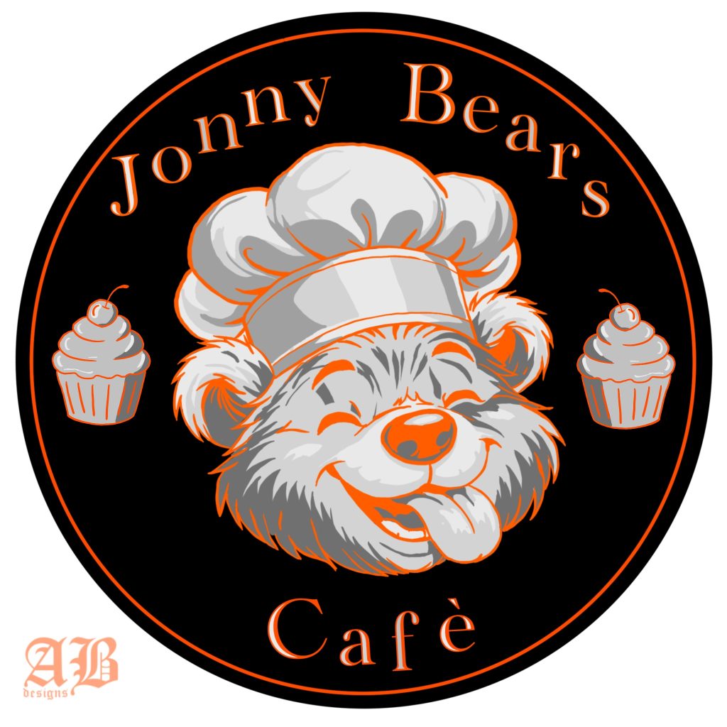
Jonny Bears Cafe
A logo created for a café based in Mauritius, developed in response to a specific client brief. The design combines a warm, playful visual identity with a bold and approachable aesthetic, immediately communicating the personality and character of the café.
The colour palette was carefully selected in line with the client’s requirements, incorporating bright oranges alongside white, black, and a range of greys. The result is a distinctive and versatile identity that balances personality with a strong sense of visual clarity.
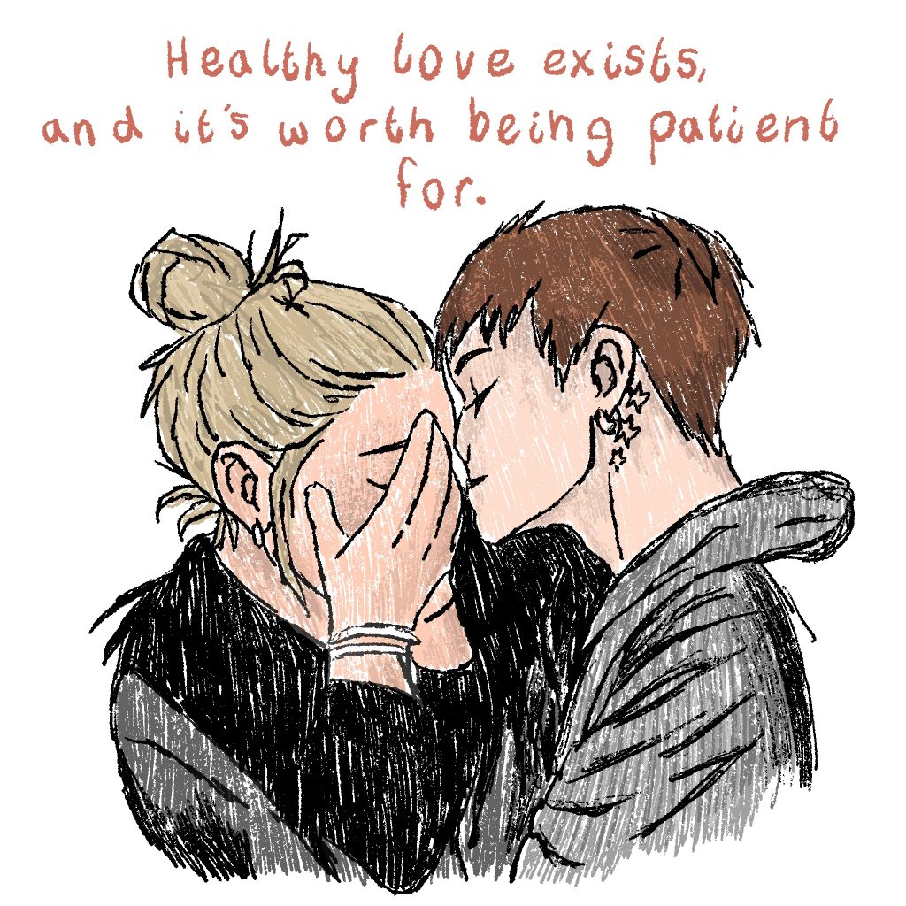
Healthy love exists
This piece is part of a series exploring the relationship between words, emotion and visual expression. For each piece, I began with a quote and used it as a starting point to interpret and visually communicate how it made me feel.
A digital portrait of my friend and her partner, created in a simple, playful cartoon style. The use of a muted colour palette gives the piece a soft and understated feel, while the simplified forms and expressive details capture the character and connection between the two subjects.
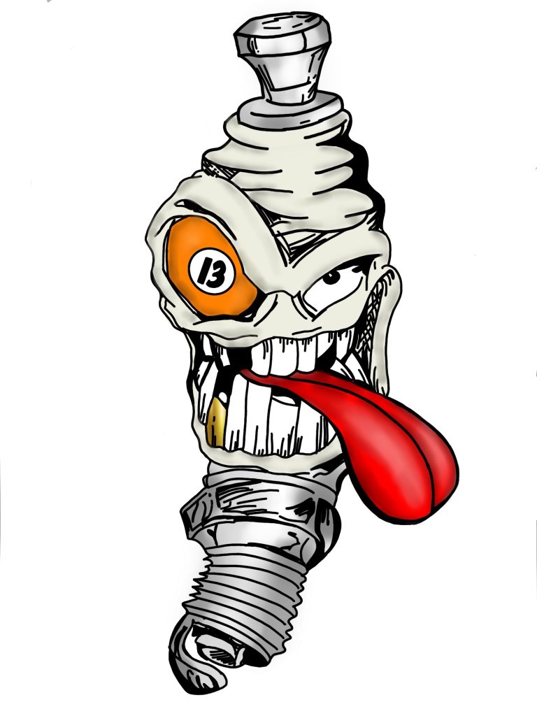
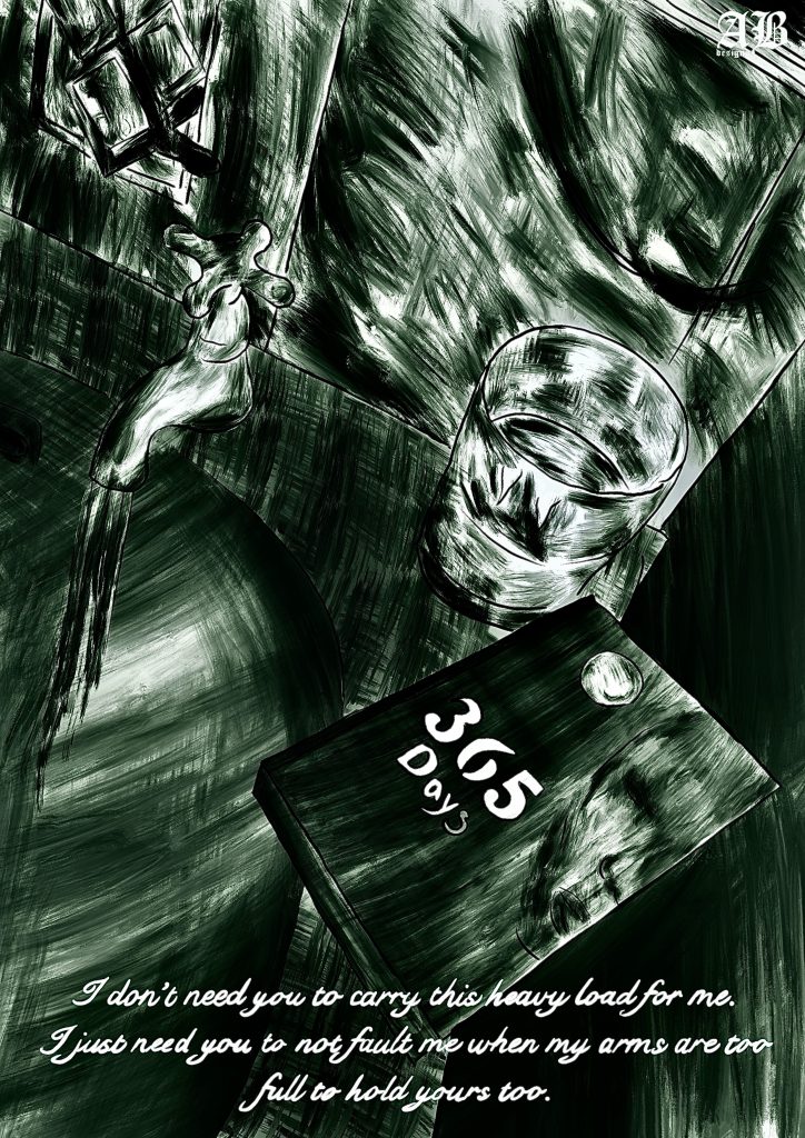
Spark Plug
A cartoon spark plug created for the engineering department at my former college, using the existing character “Mr Sparky” as inspiration, as requested in the brief.
The design combines a playful, approachable style with the recognisable form of a spark plug, creating a character that reflects the practical and technical nature of the engineering department while remaining engaging and memorable.
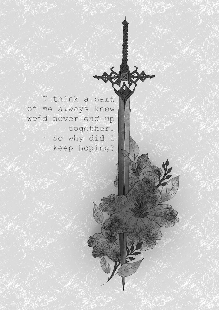
Sword Design
This A4 piece is part of a series exploring the relationship between words, emotion and visual expression. For each piece, I began with a quote and used it as a starting point to interpret and visually communicate how it made me feel.
A monochromatic sword and flower illustration created using delicate, fine line work. The contrast between the strength and symbolism of the sword and the softness of the flowers creates a balanced, elegant composition, with the grayscale palette keeping the overall design understated and refined.
Observational Drawing
An A4 digital observational drawing focused entirely on tonal variation and texture. Created using a single colour, the piece explores how depth, form, and surface detail can be communicated through subtle shifts in tone rather than relying on a varied colour palette.
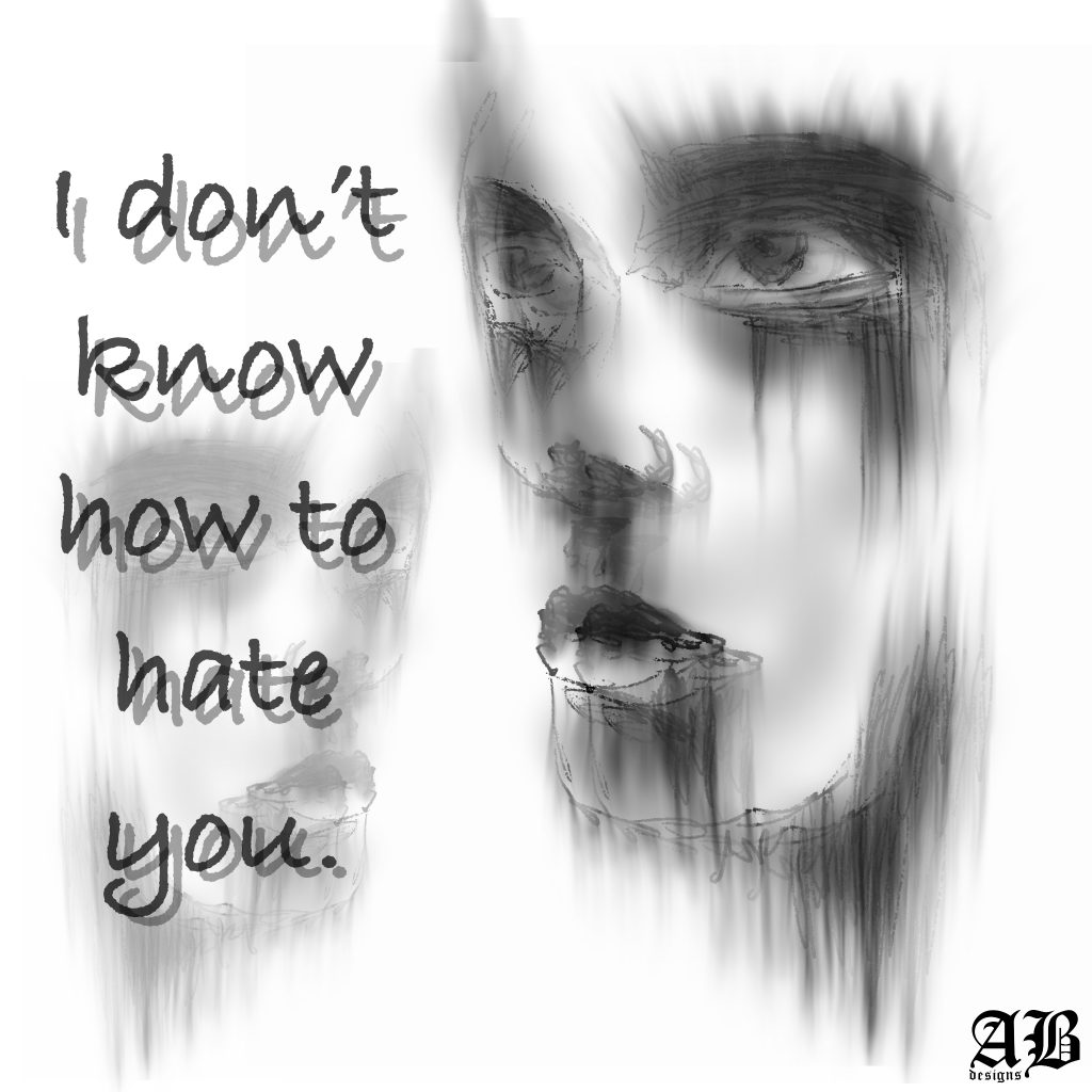
“I don’t know how to hate you”
This A4 piece is part of a series exploring the relationship between words, emotion and visual expression. For each piece, I began with a quote and used it as a starting point to interpret and visually communicate how it made me feel.
For this piece, I wanted to create a blurred, simplified aesthetic with an almost ghost-like quality. The softened imagery creates a sense of distance and ambiguity, encouraging the viewer to focus on the atmosphere of the work rather than the finer details.
I also wanted the typography to hold equal importance to the imagery, allowing the text and visual elements to work together rather than one becoming secondary to the other.
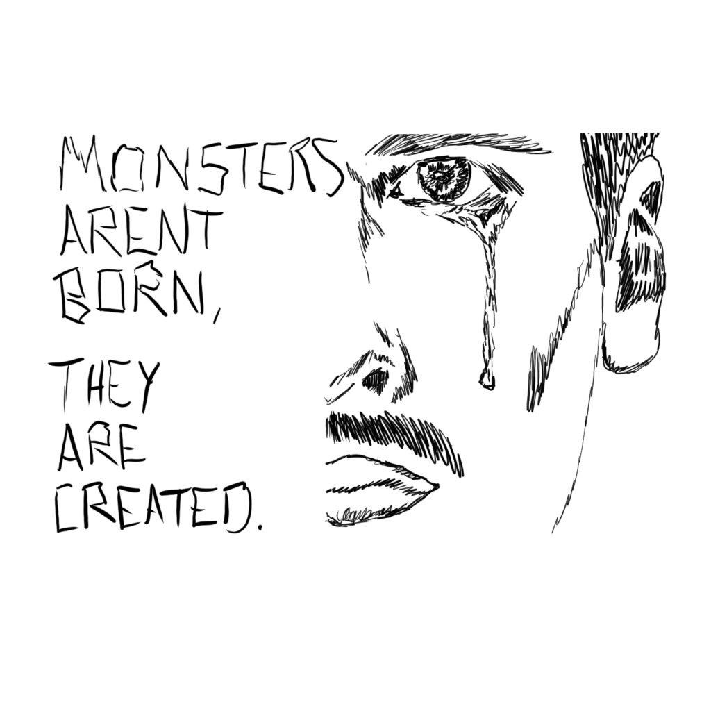
“Monsters aren’t born, they are created.”
A solely line-based piece created using a single, consistent line weight. I wanted the bold typography to feel integrated into the illustration rather than existing separately, allowing the words and imagery to become one cohesive composition.
The statement “Monsters aren’t born, they’re created” explores the idea that harmful and destructive behaviour is often shaped by environment, upbringing, experiences, and society rather than being inherently present from birth. The piece questions where responsibility lies in the creation of individuals who go on to cause harm, and challenges the idea that people can simply be categorised as inherently “monstrous.”
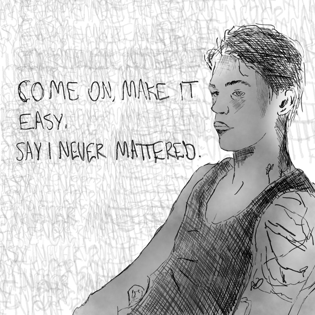
“Come on, make it easy, say I never mattered.”
A character portrait created using simplified line, form, and tonal elements, set against a textured and layered typographic background. The combination of restrained imagery and fragmented text creates a sense of emotional tension, with the typography becoming an extension of the character’s inner thoughts.
The phrase “Come on, make it easy, say I need mattered” explores vulnerability, reassurance, and the desire to feel significant to another person. The piece reflects the difficulty of expressing emotional needs directly, particularly the longing to know that your presence, feelings, and absence matter to someone else. The layered typography reflects these conflicting thoughts, creating a visual representation of an internal conversation.
Healing Begins
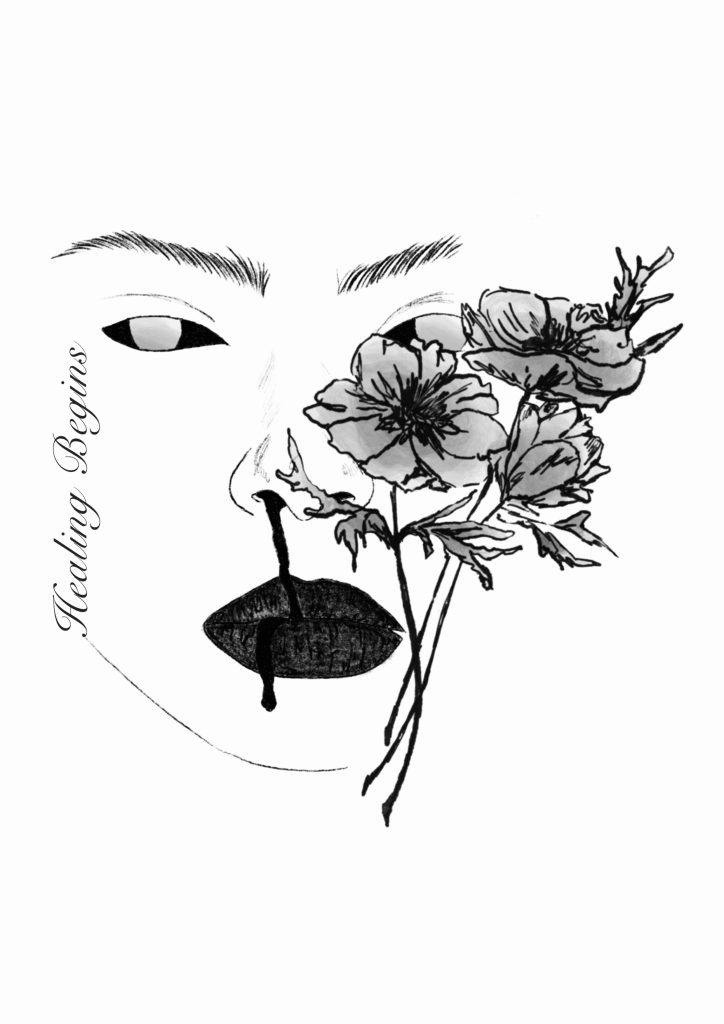
Created as part of my final university project, this piece explores themes of identity and the internal struggles associated with addiction and its impact on mental health. The work was informed by extensive research and interviews, allowing personal experiences and perspectives to shape the visual direction of the project.
The concept developed from an interview with an individual who described experiencing frequent nosebleeds and other physical side effects as a result of their addiction. What initially appeared as harmful or alarming symptoms had gradually become normalised, and, in some ways, even welcomed because they represented a necessary part of reaching the sense of softness and calm experienced during a high.
The piece explores this contradiction: the desire to escape emotional distress and find a moment of calm, despite the physical and psychological harm required to achieve it. It considers how addiction can alter perceptions of pain, normality, and identity, and how destructive behaviours can become intertwined with the pursuit of comfort.
Bunnies
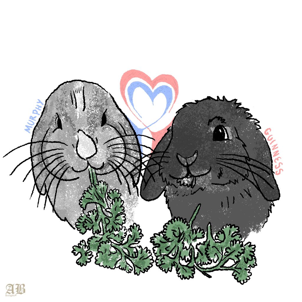
A commissioned cartoon pet portrait created for a pet owner, capturing the individual personalities and charm of their bunnies through a playful, simplified style.
Using clean linework and simple shapes, I focused on translating each bunny’s unique characteristics and expressions into an illustration that feels both personal and recognisable. The minimal approach allows their individual personalities and natural cuteness to remain the main focus of the piece.
“I hope hurting me healed you”
This A4 piece is part of a series exploring the relationship between words, emotion and visual expression. For each piece, I began with a quote and used it as a starting point to interpret and visually communicate how it made me feel.
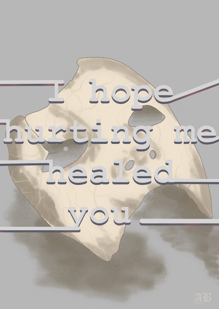
A digital piece created using a muted tonal colour palette, centred around a simple fractured mask in a soft beige, skin-like tone. The restrained palette creates a subdued and intimate atmosphere, allowing the imagery and statement to carry the emotional weight of the work.
The phrase “I hope hurting me healed you” explores the complicated aftermath of emotional harm and the desire to understand why someone chose to cause pain. The fractured mask represents the damage left behind — something that may appear whole from a distance but is visibly broken beneath the surface. The piece questions whether hurting another person can ever truly provide healing, while reflecting on the lasting impact that emotional pain can have on identity, trust, and self-perception.
Typography
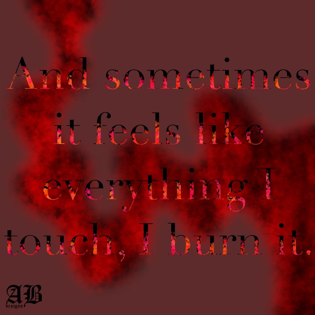
A typographic piece exploring the relationship between language, imagery, and emotion. Taking the phrase “And sometimes it feels like everything I touch, I burn it” literally, I created a visual representation of destruction through fire-inspired colour, texture, and typography.
The flames are contained within the letterforms themselves, almost as though the typography is burning from the inside. A trail of thick red smoke sits behind the text, extending across a deep burgundy background and adding to the sense of intensity and destruction.
The use of reds, burgundies, and fiery tones reinforces the emotional weight of the statement, while confining the fire within the typeface makes the words themselves feel responsible for the destruction they describe. The piece was also an exploration of typography as an image, allowing the lettering to become an active visual element rather than simply communicating the quote.
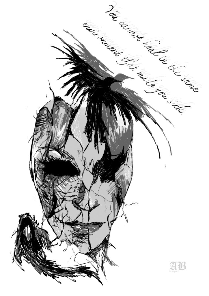
“You cannot heal in the same environment that made you sick.”
This A4 piece is part of a series exploring the relationship between words, emotion and visual expression. For each piece, I began with a quote and used it as a starting point to interpret and visually communicate how it made me feel.
An A4 digital piece exploring the relationship between mental health, identity, and environment. Following research into mental health and the ways in which surroundings can influence emotional wellbeing, I created a minimal yet symbolic composition using simple black and grey tones with varied line weights.
At the centre of the piece, a broken mask represents a fractured sense of self and the lasting impact that harmful environments can have on identity. A crow sits in the upper right, contrasted by a fish in the lower left, placing two creatures within environments that are fundamentally different to their natural surroundings. This contrast reinforces the idea that healing and wellbeing can depend heavily on the environment in which we exist.
The simplicity of the imagery allows the symbolism to remain the focus, while the fractured mask connects the external environment to the internal effects of mental distress. The piece considers the importance of recognising when a familiar environment has become damaging, and the difficulty of healing while remaining surrounded by the conditions that contributed to that harm.
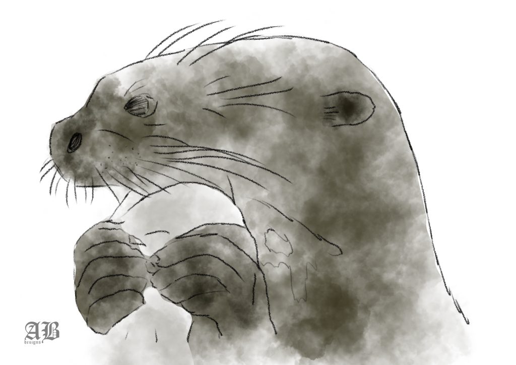
Otter
Created as part of my university project in collaboration with The Broads Authority, this piece was developed during a boating trip across the River Waveney at Oulton Broad. The idea came directly from the guide’s discussion during the tour, inspiring me to create a quick visual response to the wildlife and natural environment of The Broads.
Produced in approximately 10–15 minutes, the illustration is intentionally simple and observational. I focused on the most recognisable characteristics of the otter, reducing the subject to its essential forms and features rather than capturing unnecessary detail.
The piece reflects the spontaneity of drawing within the environment itself, allowing the experience and information gathered during the trip to directly influence the creative process.
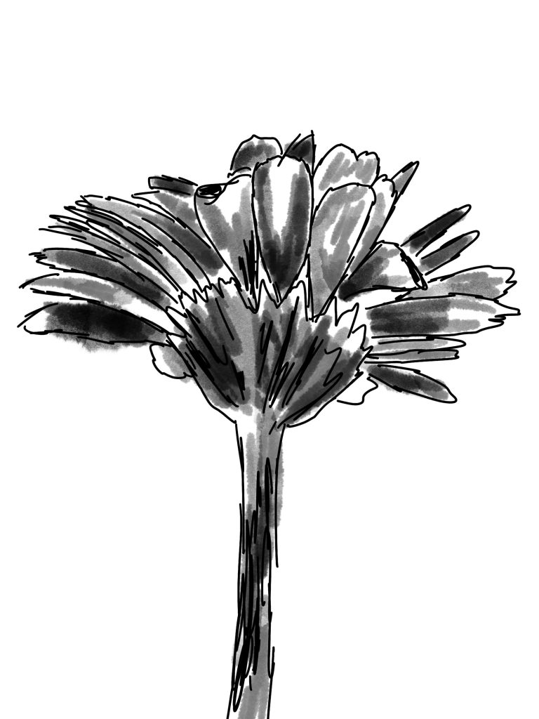
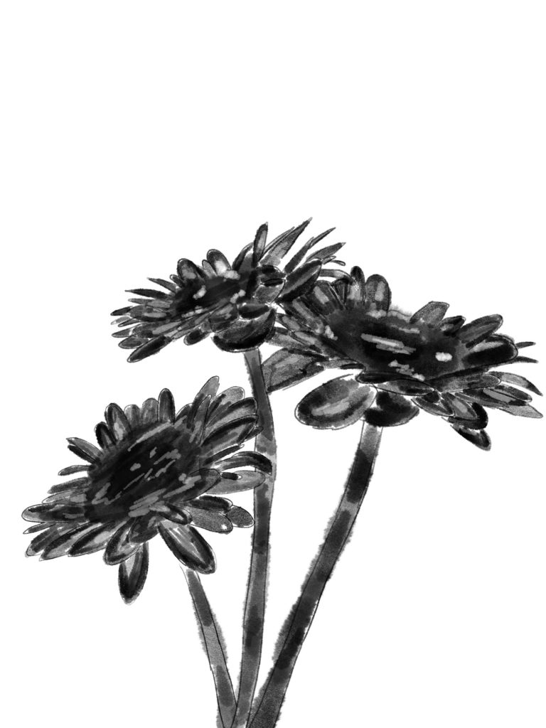
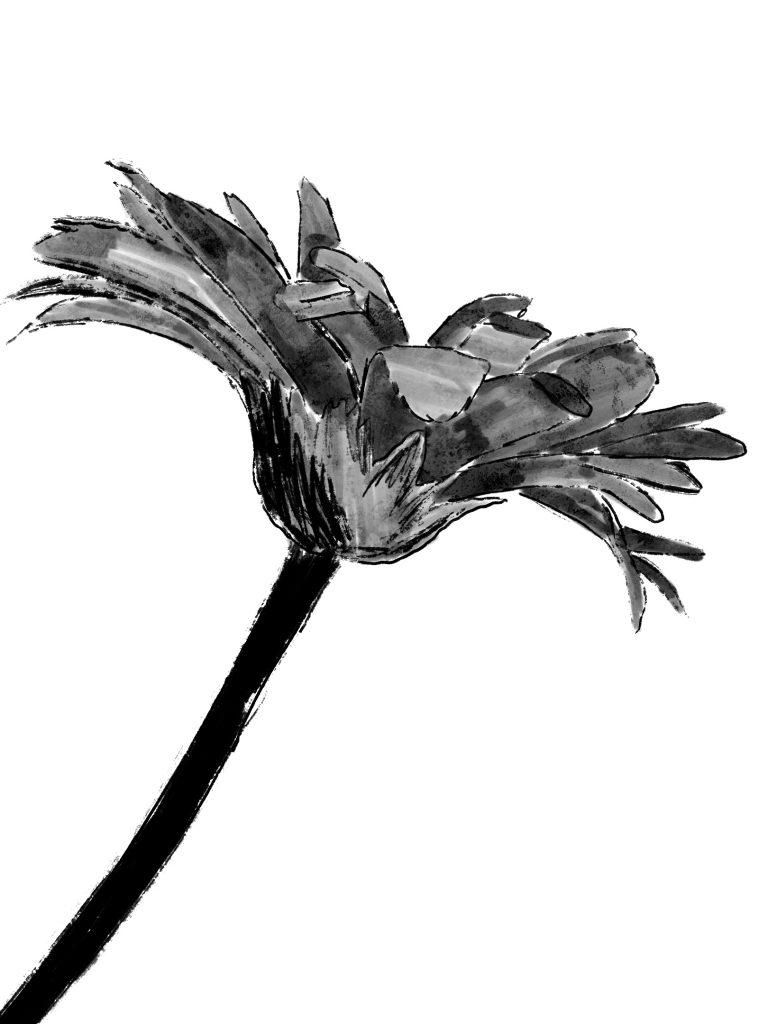
Tonal flower observational sketches
These tonal observation sketches were created during my first year at university as part of a two-week observational drawing exercise. The brief was intentionally simple: observe and interpret flowers, drawing nothing else throughout the project.
The focus was on accurately capturing the forms, shapes, lines, and tonal qualities of what was directly in front of me. The exercise taught me an important lesson that continues to influence my practice – to draw what I actually see, rather than what I think I see.
Reducing the flowers into simple shapes and lines became a surprisingly deliberate and challenging process, forcing me to slow down and pay closer attention to the details of the subject. This way of working has stayed with me beyond the project; I still return to observational drawing and simplifying forms whenever I experience artist’s block, using the process as a way to reconnect with seeing and creating without overthinking.
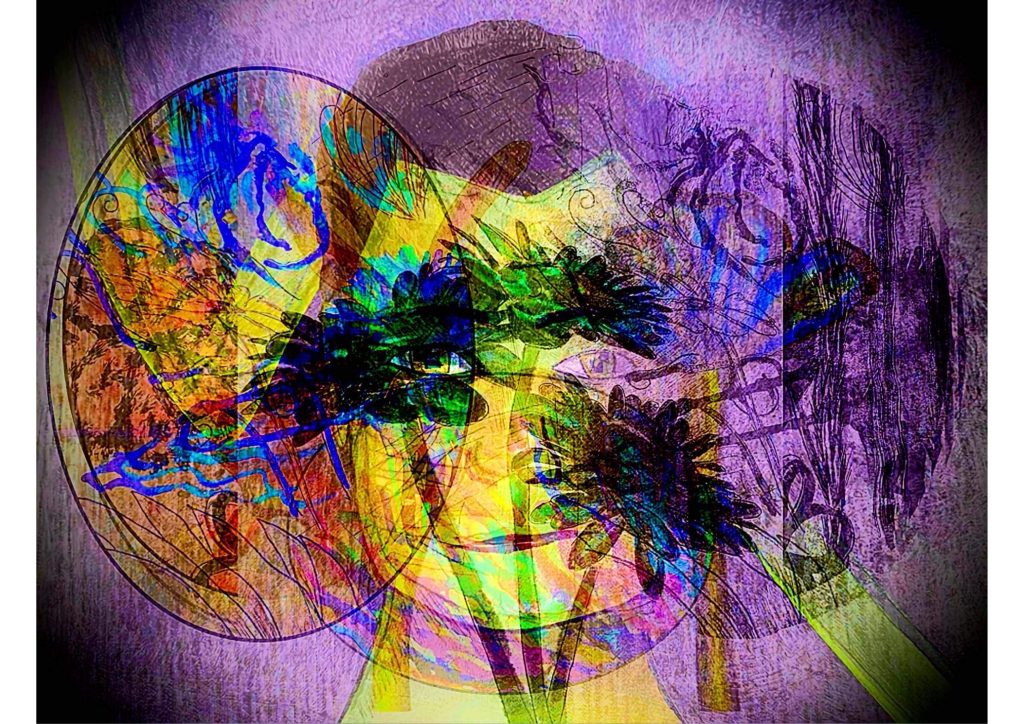
Layered digital combination
Created at the end of my first unit during my first year of university, this piece was designed as the front cover for my supporting documentation PDF. It brings together a selection of the strongest imagery developed throughout the unit, creating a visual overview of my creative exploration and development.
The composition incorporates snippets from my observational flower studies alongside imagery from my interpretation of Frankenstein, bringing together two contrasting areas of the project within a single piece. The cover was intended to reflect the range of approaches explored throughout the unit while providing a cohesive introduction to the work that follows.
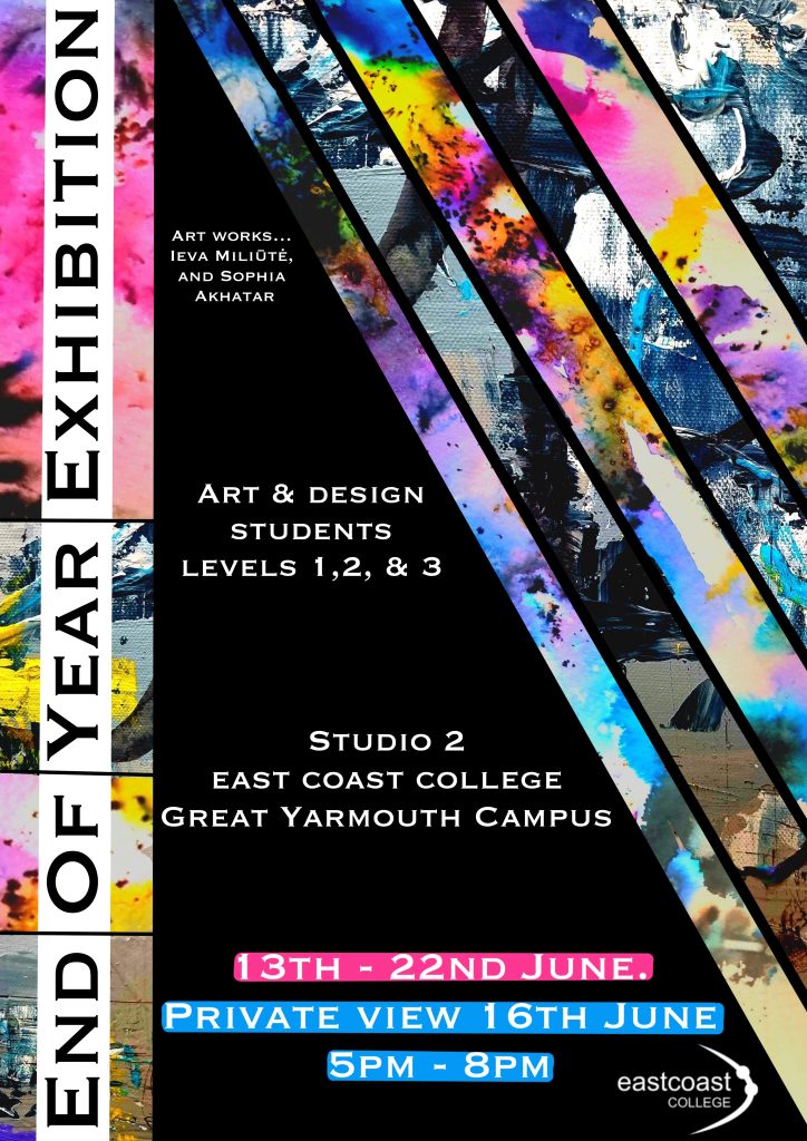
End of year exhibition poster
I was selected to design the poster for my college’s end-of-year art exhibition, with full creative freedom over the visual direction. The brief required only the inclusion of key event information and the college logo, allowing me to develop the concept and composition independently.
To make the poster feel representative of the exhibition itself, I incorporated and drew inspiration from the work of two of my peers, using their artwork as key visual elements within the design. This created a collaborative piece that showcased the variety and creativity of the students involved in the exhibition.
The final poster was printed and displayed throughout the local town and across the college, giving the work a public-facing application beyond the studio environment.